As a business owner, you must realize that the logo for your company visually represents your brand. You cannot afford to make a mistake during the logo design process. Otherwise you could potentially misrepresent your brand and unintentionally harm your company in the process. No one wants you to accidentally get this crucial step wrong and damage your chances for bringing in new business.
Believe it or not, you may not intentionally create every detail of your logo, but each one of those details is going to have a positive or negative influence on your customers. You should never create an arbitrary logo unless you’re intentionally trying to damage your reputation in business. Obviously no one would ever go out of their way to hurt their company.
Make it a point to take your logo design seriously. Make sure your logo serves the best interests of your brand, your business, and your customers. Make sure your design choices communicate the proper message with intention and direction. Otherwise you could unintentionally convey the wrong message with a thoughtless design and mislead or confuse your potential customers. Or you might accidentally create a logo that says nothing at all.
Choosing the right colors and fonts is deeply rooted into the psychology of logo design. Making these choices will have a major impact on whether or not people decide to purchase your products and services. Keep reading to learn about the psychology of logo design regarding fonts and colors in greater detail below.
Fonts and Their Relationship to Logo Design Psychology
You may not realize this, but fonts and typeset choices have an impact on the way people think and act from a psychological standpoint. Even more important, when you choose a particular font it has the ability to generate certain emotions and psychological responses that many business owners don’t take into consideration.
Why does this happen? Well, the shapes of the letters themselves create a psychological response. These letters have their own personality, so to speak, so when you choose one for your business, you have to pick a font that expresses the “personality” that you’re trying to get across.
How about typography? Where does it fit along the psychological scale? The exciting thing about typography is it’s used to communicate words in the written form. But it has the ability to communicate on an emotional level as well. If you have the right font choice with your typography, you can communicate different types of emotions like joy, happiness, fun, excitement, and much more.
Choosing the Best Fonts to Portray Your Branding Message
Do you want your company to have a vibrant personality? Changing the font on your logo design can create this experience for your customers. The best fonts to portray a vibrant personality include serif and sans serif typefaces.
For the most part, people will immediately recognize sans serif and serif typefaces. And for most businesses, this is the perfect option to meet their needs. But it’s not necessarily going to be the right fit for every company, so keep that in mind.
Some businesses might prefer to avoid trying to seem too upbeat and energetic. They may choose a more conventional approach to their logo design and creation. So they would want to pick more conventional fonts to better suit their needs. The best choices in this regard are the fonts that you can immediately recognize like Arial, Times New Roman, and Helvetica. These choices are considered stable and mature.
Do you have an offbeat or quirky company? Are you trying to portray a unique and inspirational message with this offbeat business? During the logo design process, you may benefit tremendously from an offbeat font choice like Papyrus or Kirsten.
For the more casual companies and brands, you may want to portray a youthful appearance to target a much younger audience. If your target market is young adults in their teenage years or early 20s, you may want to go with a more casual or happy font choice like Comic Sans. This quirky font style will get your message across and appeal to a much younger audience.
All in all, when choosing a font the most important thing is to pick one that is readable and legible. Some logos miss the mark entirely and it’s very difficult for their customers to figure out their message and the name of their business or brand. Avoid this pitfall at all costs and your customers and potential customers will definitely remember your name, your business, and your overall company message.
Colors and Their Relationship to Logo Design Psychology
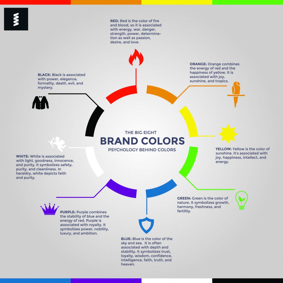
Just like fonts, choosing the right colors for your company logo can have a massive impact on your customers. Colors provide strong emotional triggers that can be used to entice your customer base to purchase your products and services.
As you undoubtedly know, there are many colors that have links to the human psyche and possess strong emotional characteristics and feelings. Our brains are hardwired to interpret these colors based on experiences, cultural influences, and other factors that have been drilled into our brains practically since birth.
It should come as no surprise to learn that certain colors will stimulate particular emotions when we see them. To help you better understand how colors can impact your psychology and the way that you think, we’ll share some of the most popular colors and the emotional connection that they maintain.
10 Colors and the Psychological Impact They Have on Our Emotions
- Red – this is one of the most exciting colors in the rainbow. The color red has a tendency to really get your attention and make you stand up and take notice. That’s why they made stoplights and stop signs read because you’ll absolutely notice them since the color really stands out. Besides the excitement of the color red, it’s also comforting, life-affirming, connected to love and anger, and this color is also very warm.
- Blue – this color is great for companies that want their brand to come across as honest and filled with integrity. Blue signifies that your business creates high-quality products or delivers high-quality services of the utmost capability. It shows your customers that you are confident, trustworthy, reliable, and an honest organization. If you’re struggling with a perception problem, consider changing your logo to the color blue to help curb the tide in your favor.
- Purple – the color purple is perfect for creative types and businesses that are trying to give off the perception of mystery. Besides purple, the color violet which is also in the purple family connotes feelings of respect, royalty, and playfulness as well. This is a great logo color choice for creative and forthright businesses that command respect.
- Gray – the color gray is ideal for businesses of a practical nature. This color proves to your customer base that your business is focused on timeliness, practicality, and it operates in the moment. It also communicates refinement and neutrality as well. This is good for companies that want to approach a broad customer base while remaining neutral.
- White – the color white has a tendency to promote innocence. It’s also a great company color if you’re trying to show that you are pure, clean, and neutral as well. It’s a great logo color for cleaning services, child daycare centers, baby clothing stores, and decluttering or organizational services.
- Pink – the color pink is romantic and also lends businesses a measure of sophistication as well. It also shows your customers that the company evokes compassion, love, and gentleness. Many female-oriented businesses use the color pink in their logos, but it isn’t reserved for women. Male focused companies can use this color as well if they’re trying to show off their pure and decent nature.
- Black – the color black is very serious. When businesses use the color black in their logo, it shows that they are no-nonsense, intelligent, and sophisticated. It also shows that the company is highbrow and expensive. It lets your customers know exactly what you’re worth and it commands respect.
- Brown – this is an outdoorsy color that works well for companies with a rugged, friendly, organic, and natural demeanor. Outdoor companies, sporting goods businesses, and landscaping services would do well with the color brown in their logo.
- Green – the color green is also great for outdoorsy type companies as well. It also represents knowledge, health, sustainability, and balance. Financial companies do well when using the color green in their logo because it’s associated with money. It’s also associated with nature, so if your company is focused on nature using green in the logo is a good idea.
- Yellow – the color yellow is more youthful and adventurous. It represents enthusiasm, happiness, and travel. Airlines, kids clothing stores, and cruise lines benefit from the color yellow in their logo.
Bottom Line
As you can see, fonts and colors definitely play an important part in the logo design process. They both have a tendency to bring out emotions in your customers and getting the emotions wrong could mean the difference between success and failure in your business. So make it a point to study this information and choose the right fonts and colors that will promote your products or services effectively.


